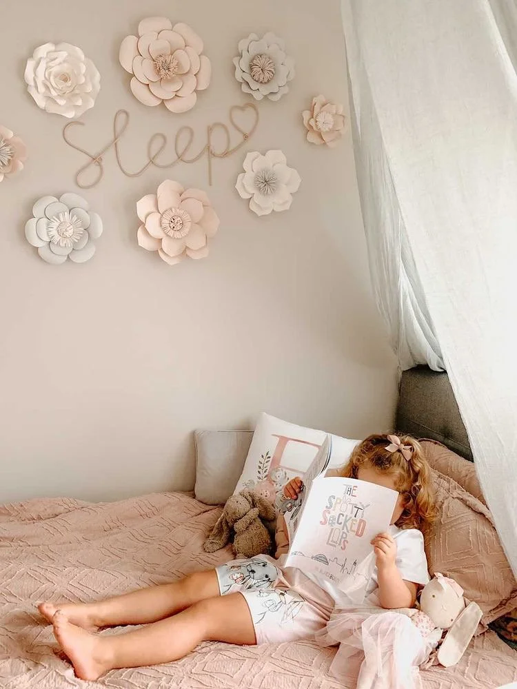
The Spotty Socked Lops
Scope
Brand Identity
Website Design & Build
Illustration
Print & Publishing
Collateral Design
Social Media/Digital Persona
Narrative Development
Animation
The Journey
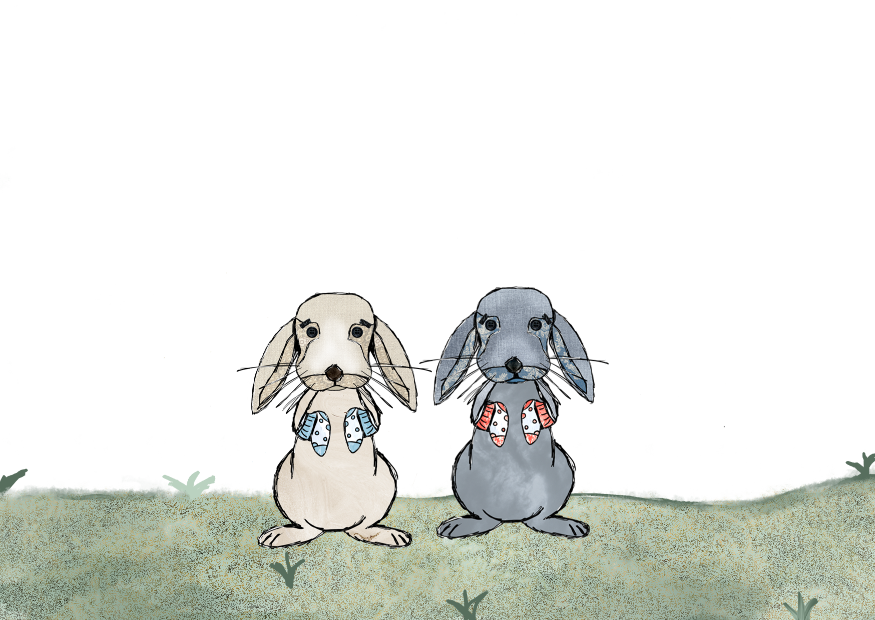
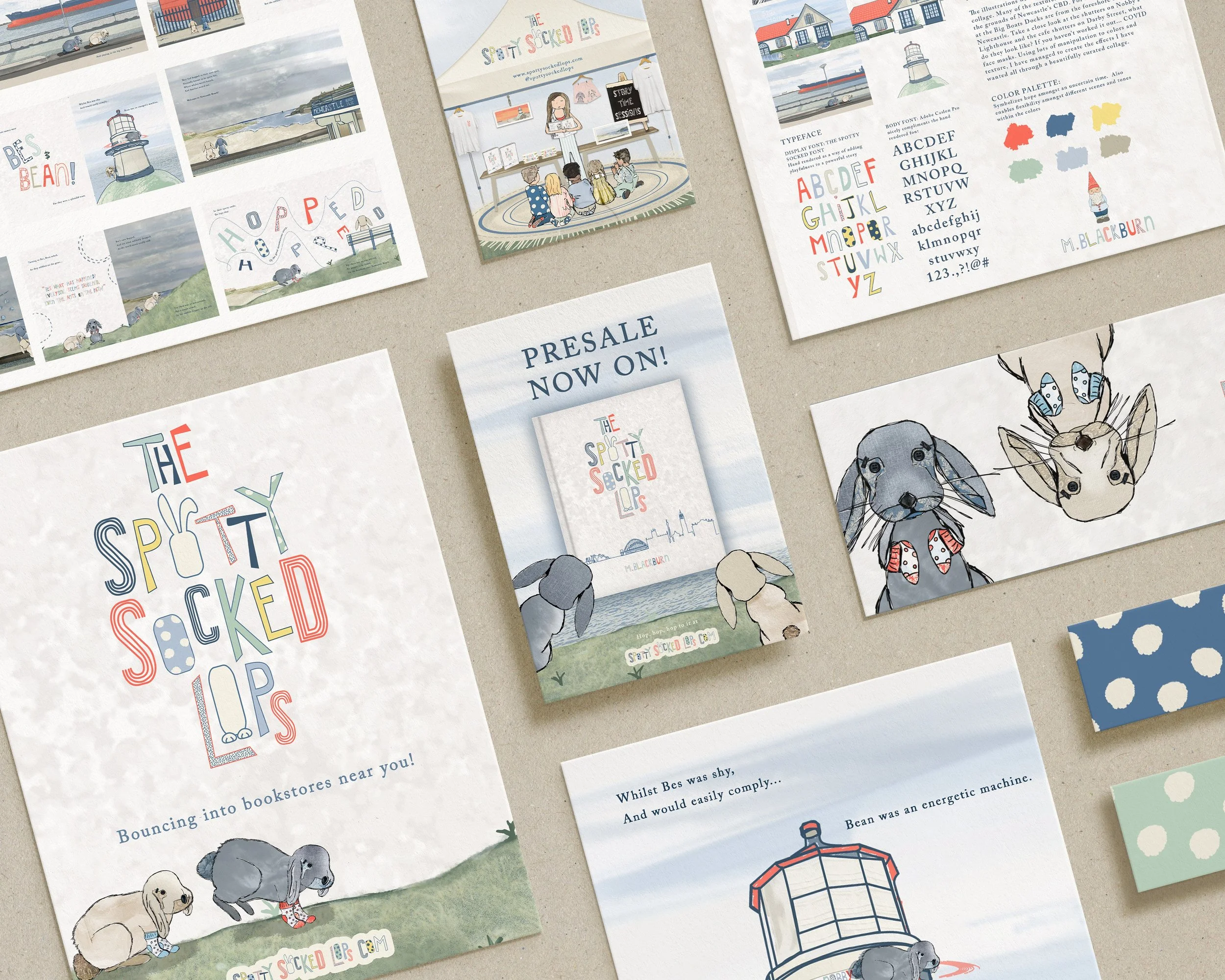
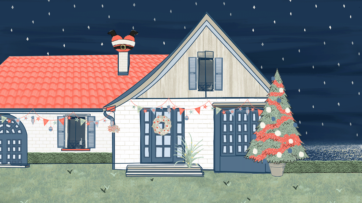
The Spotty Socked Lops is a cheeky, rhyming picture book that will delight young and old alike, capturing the spirit of the year 2020 through the adventures of two baby rabbits, Bessie and Bean. Written and illustrated by Meg Blackburn and published by 123 Creative (MB Design Co), the story celebrates teamwork, courage, and perseverance as the bunnies bounce over the hurdles life throws their way.
2020 was a challenging and uncertain year for everyone, including our youngest community members. The Spotty Socked Lops gives children a playful window into the events of that year, helping them understand and navigate the changes around them, while also serving as a keepsake to remember the times we’ve shared.
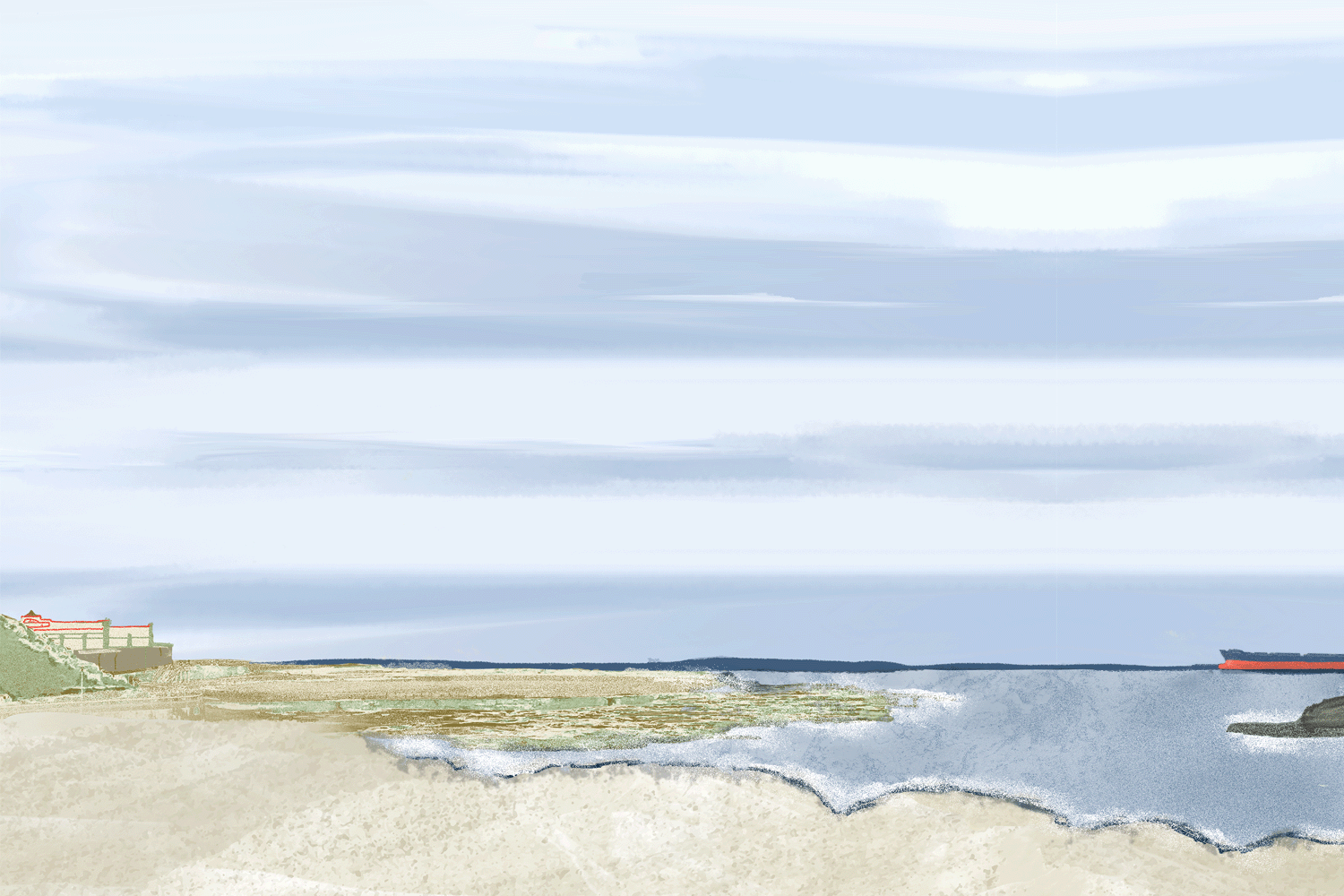
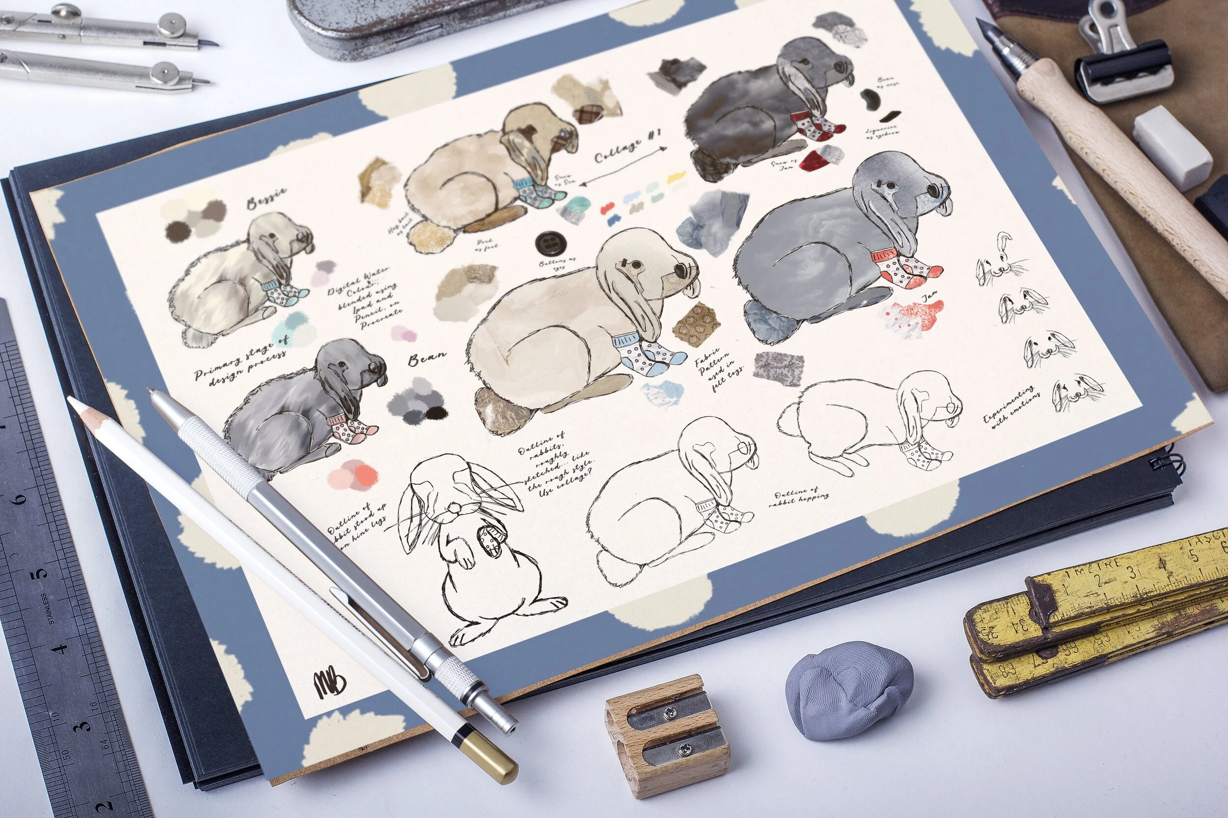
Illustrations
The illustrations throughout the book are developed using a curated collage-based approach. Textural elements have been sourced from the physical environment of Newcastle’s CBD, grounding the visual narrative in familiar and local surroundings. For example, paving textures from the Big Boats Dock foreshore have been incorporated into the compositions, embedding a sense of place within the artwork.
Subtle visual references are woven throughout the illustrations, including details inspired by the shutters at Nobby’s Lighthouse and café awnings along Darby Street, which are abstracted to resemble COVID face masks. Through considered colour manipulation and layered textural treatments, these elements are transformed into cohesive, visually rich compositions.
This approach allowed for the creation of a thoughtfully constructed collage style that reflects both the context of the story and the period it represents, resulting in illustrations that are conceptually grounded, textured, and intentionally designed.
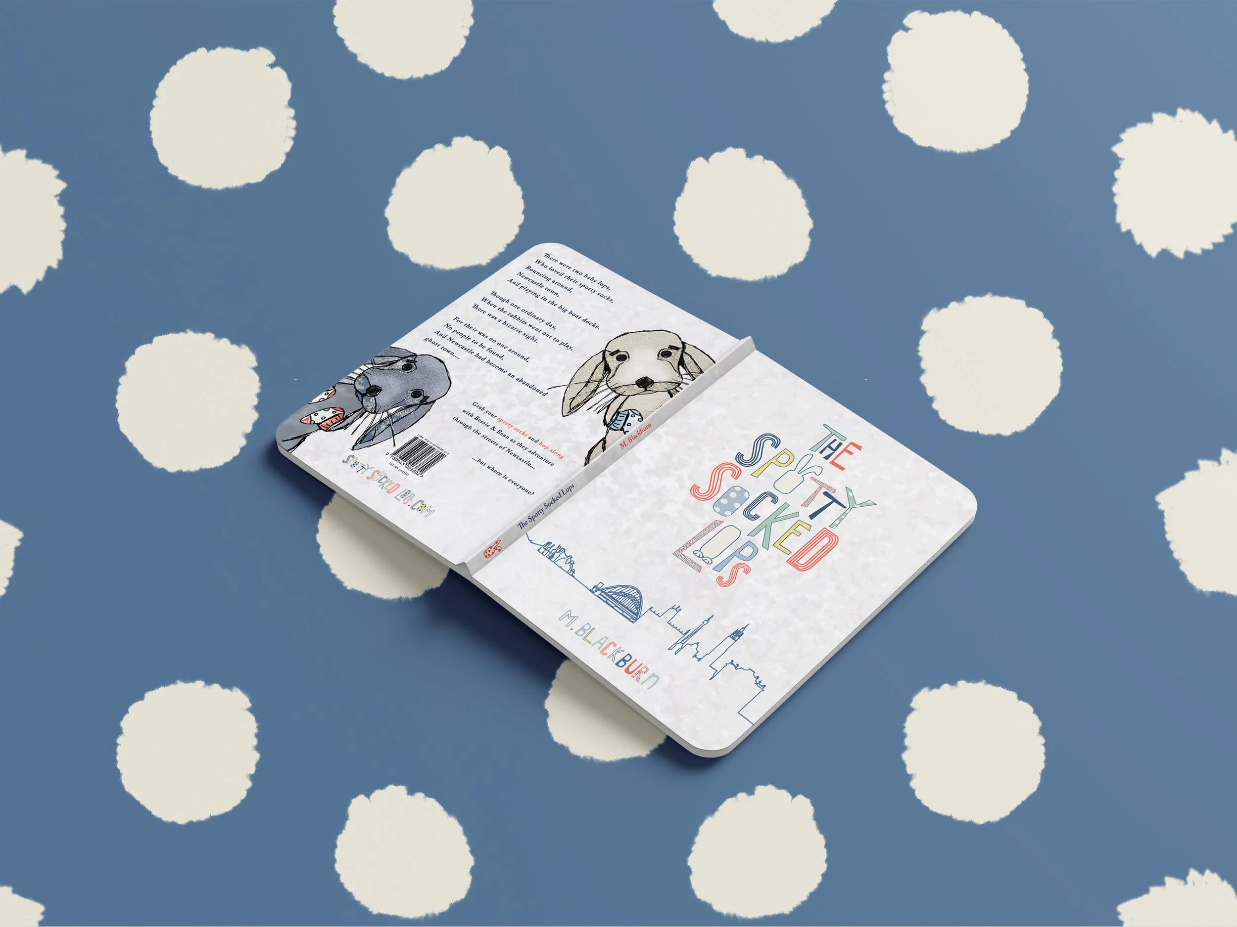
The Brand
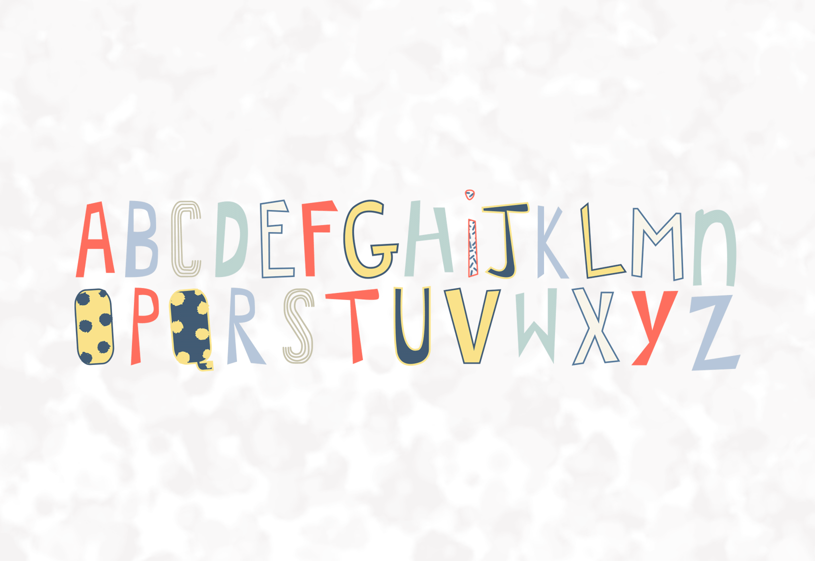
The brand identity for The Spotty Socked Lops quickly evolved beyond the pages of the book, growing into a recognisable and much-loved presence within the local community. Central to the brand was a bespoke typeface, Cheeky Face, designed specifically for the project and used consistently throughout the book and all supporting marketing materials. This unique typographic approach, paired with a soft pastel colour palette, created a playful yet distinctive aesthetic that resonated strongly with both children and adults.
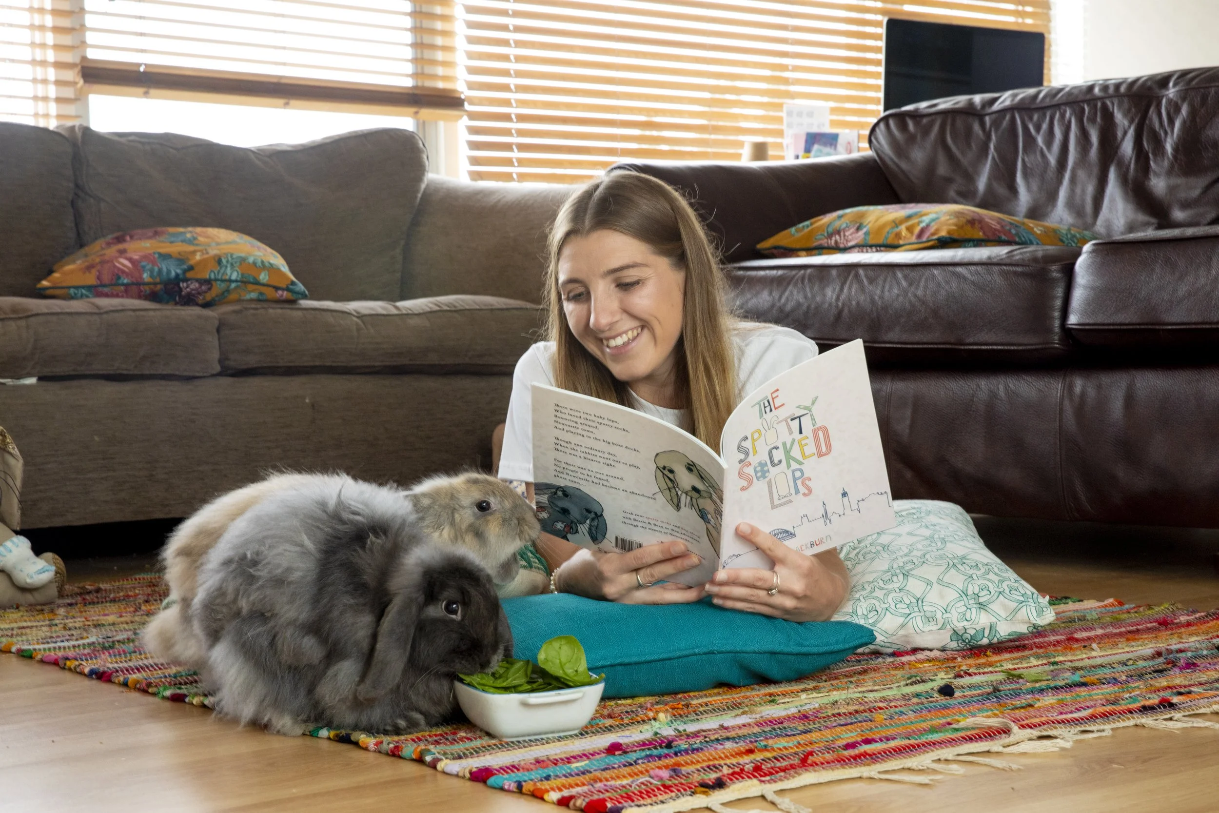
The brand captured a specific moment in time, delivering a clear and engaging message through illustrative-led marketing and thoughtful visual storytelling. Its cohesive identity enabled the story to extend naturally across multiple touchpoints, from bookstores and schools to local markets throughout Newcastle, NSW.
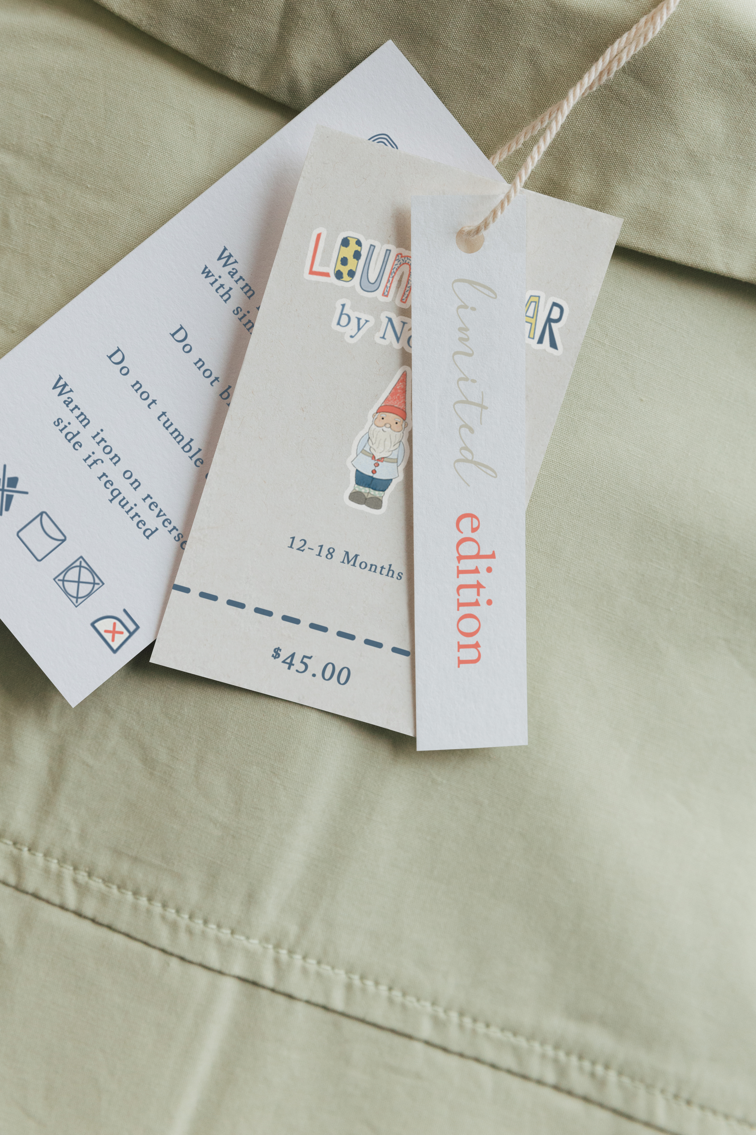
As demand grew, the brand expanded into a range of merchandise, including pyjamas, colouring sheets, clothing, baby grows, and socks. Author readings at schools and appearances at local markets further strengthened the connection with the community, allowing the story and its characters to be experienced beyond the book itself.
Featured in Newcastle Weekly
Animation
Stop-motion animation was incorporated as a key extension of the brand, bringing the story and its characters to life beyond the printed page. These animations were developed to support a range of digital materials, including online games and interactive content, allowing audiences to engage with the story in new and playful ways.
Through animation, each character was given a distinct personality, movement, and sense of expression, strengthening emotional connection and familiarity with the brand. The tactile nature of stop-motion echoed the handmade, illustrative quality of the book, ensuring consistency across both physical and digital touchpoints.
This interactive layer added depth to the brand experience, encouraging exploration and participation while extending the narrative into digital spaces. By blending storytelling, illustration, and animation, the project created a dynamic and engaging way for children to connect with the characters, reinforcing the brand’s presence and longevity.
Print & Publication
We collaborated with local printers, WHO Printing, to bring the story to life, guiding the creative process from concept to publication with care and attention to detail. The book has been warmly received, with over 800 copies sold and the final print run now sold out — a testament to its charm, heart, and enduring appeal.